
As per the latest estimate, companies create 328.77 terabytes of data every day globally. This massive amount makes it increasingly difficult for companies to get valuable insights. Here, Power BI lends a helping hand through effective data visualization. In this post, we will dig deep into the world of data visualizations with Power BI dashboard examples. Let’s start with introducing a robust data visualization tool, Power BI.
What is a Power BI dashboard?
A Power BI dashboard is a powerful and interactive tool for data visualization within the Microsoft Power BI platform. It is designed to provide users with a consolidated view of critical data points and KPIs (Key Performance Indicators) from different sources. Power BI dashboards are highly customizable and they have visually appealing interfaces. Users can monitor, analyze, and share useful data insights in real time with the help of a Power BI dashboard.
How can Power BI dashboards be used to improve business performance?
Power BI dashboard Examples
Power BI Dashboards are useful to monitor and manage various processes across different departments. Let’s see four Power BI Dashboard examples with images.
Sales dashboard
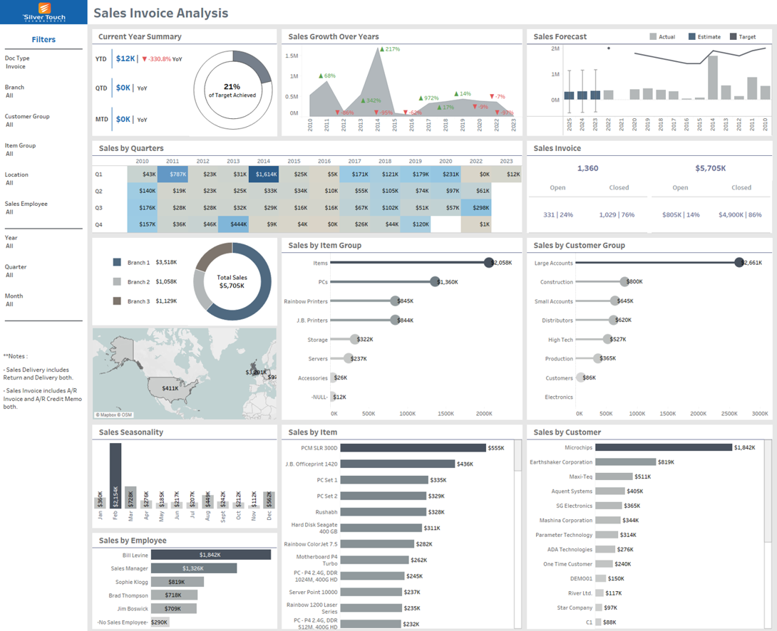
Product Sales Dashboard is a simple yet highly accurate tool to see sales performance. The dashboard can break down sales performance into different categories like Top States, Top Countries, and Top Cities. It is also possible to categorize the dashboard into regions to keep the guesswork away from your business. Charts and line graphs in the Sales Dashboard make it easy to make strategic decisions for multiple products simultaneously.
Marketing dashboard
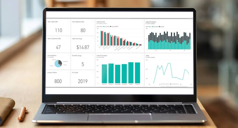
Power BI can show clear visuals on the budget, spending, and outcome in the marketing dashboard. This dashboard can help businesses gain clarity and actionable insights into the data set by showcasing financial performance or marketing metrics. Companies can manage their marketing campaigns effectively with real-time analysis and clarity. This dashboard is also useful in monitoring financial performance.
Financial Dashboard
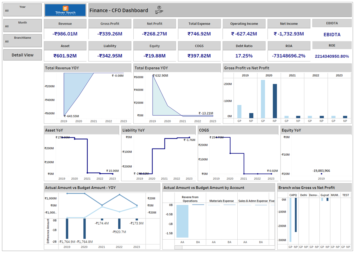
These Power BI Dashboard samples show the fundamental financial indicators of your company. Financial Dashboards showcase specific indicators for Revenue, Profit, Inventories, Accounts payable, Accounts Receivables, Securities, Earnings before Tax, etc. The company’s management can make meaningful decisions based on all these data related to accounting and financials. Another dashboard is the Financial Analytics Dashboard which analyzes the FPIs (Financial Performance Indicators).
HR Dashboard
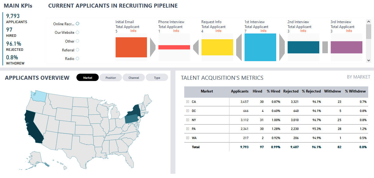
It is an excellent tool for the HR department that showcases total applicants, total rejected, total hired, and withdrawals during the recruitment process. You can see the pipeline visualization of every stage of the recruiting process with the number of candidates on the top of the dashboard. It offers a simple but detailed visualization of the recruitment process including a summary of applicants and recruiting results using filters like sources, locations, etc.
How Power BI dashboards are different from Power BI reports?
When we talk about the Power BI realm, we need to discuss the difference between dashboards and reports in the Power BI. Though both are highly effective tools for analyzing and visualizing corporate data, they have differences in purposes and features.
Power BI Report
It is a collection of data visualizations, tables, and charts created from one or more datasets. Designed for detailed and interactive data analysis, the Power BI Report enables users to delve into specific data points and explore data. The Power BI report consists of multiple pages or tabs, each containing various visuals that convey different aspects of the data.
Power BI Report is ideal for data analysts and power users who want to perform detailed data analysis and create rich interactive visuals.
Power BI Dashboard
It is designed to provide a high-level overview of data and are meant to be concise and focused on specific insights. It often includes visuals like tiles, charts, and cards that display summarized data and KPIs in a visually appealing way. Power BI Dashboard is useful for quick access to critical information and enables users to pin visuals from reports to dashboards to create a consolidated view of key metrics.
Power BI Dashboard is suitable for business users, managers, and executives who need a quick and easily accessible summary of relevant data.
A combination of Power BI Reports and dashboards provides users with a complete data analysis and monitoring solution.
After discussing different Power BI dashboard samples and the difference between Power BI Dashboard vs Report, let’s go through some useful tips for creating effective Power BI Dashboards.
Top Tips for Creating Effective Power BI Dashboards
The Power BI Dashboard can cover many aspects of business processes and data analysis. The following useful tips will help you leverage the benefits of Power BI dashboards.
Identify Objectives
Define end users for your Power BI dashboard and identify core objectives. You can make a list of necessary aspects based on users and tailor your dashboard to meet their specific requirements effectively.
Think of Storyboard
You can make your dashboard more appealing and interactive by using visuals and text to highlight all the necessary information. Your dashboard should tell a story of your business and show trends in an appealing way.
Keep It Simple
Some companies make things overcomplicated while creating a dashboard. It is necessary to avoid complexities by keeping the layout simple and user-friendly. You can focus on the most important visuals and metrics.
Use Full-screen Mode
A full-screen mode enables users to focus on the dashboard. As a result, you can reduce the chances of skipping any important information or trends related to your business processes or reports.
Consider a Theme
A specific theme as per your business model can give your dashboard a consistent look and feel. Power BI offers multiple pre-built themes. You can also create your own theme and make the dashboard more attractive. Think about LayoutYou can make a plan on how to arrange visuals and text in your dashboard. Your dashboard’s layout should be designed in a way that users can find and understand the most important information easily.
Use Slicers
Both filters and slicers enable users to interact with the dashboard and visualize the data. Slicers can help users find specific information or insights quickly. Filters are useful for finding specific details.
Utilize Tooltips
Tooltips can provide users with additional information about the data when users check visuals. When it comes to understanding the data or visuals in more detail, tooltips can play a vital role in the dashboard.
Add Interactivity
Features like drillthrough, bookmarks, and cross-filtering to assist users in exploring the data and finding the necessary information with ease. These features make the dashboard more user-friendly and interactive.
Test and Improve
Once your dashboard is ready, t is better to test it with the end users. Their feedback will help you identify areas that need improvement and you can make the dashboard more useful and user-friendly.
Concluding Remarks
Power BI Dashboards can assist companies in leveraging the advantage of data visualization. Both Power BI Dashboards and Reports are different but useful in understanding trends and insights based on data analysis. Hope this guide will help you make the most out of a Power BI Dashboard and check data related to finance, HR, Sales, and Marketing for your company.
FAQs
A Power BI Dashboard is a powerful and proven tool for data visualization. Created and maintained by Microsoft, Power BI Dashboard can help you track key metrics and identify trends.
Power BI is better as it is a more user-friendly and affordable business intelligence tool than Tableau.
DXC Modern Workplace is a suite of solutions and services that help organizations create a modern workplace for their employees. It includes solutions for workplace transformation, digital workplace, and workplace security.
A modern workplace can offer a number of benefits to both employees and employers, including increased employee productivity and engagement, reduced costs, improved decision-making, and increased customer satisfaction.
Power BI dashboard offers many benefits to modern enterprises including improved visibility, higher efficiency, and better collaboration. It also plays a vital role in improving the decision-making process.